
Lapwing Airlines
Mobile Flight Booking Experience
A concept project exploring how to create a clearer, faster, and more intuitive mobile flight-booking journey.
This case study was completed as part of the UX Design Institute diploma, where I led the full UX process - from research and insight generation to user flows, interaction design, and a functional mobile prototype.
The goal: Streamline the end-to-end booking experience and reduce friction at each step, using a user-centred and mobile-first approach.
Project Overview
Type: Concept / UX Case Study (UXDI Diploma)
Role: End-to-End UX (Research → Flows → Interaction Design → Prototype → Wireframes)
Platform: Mobile (iOS/Android)
Timeline: 8 weeks
Tools: Figma, Miro, Reflector
The Problem
Booking a flight on mobile is often slow, cluttered, and unclear. Users struggle with hidden fees, poor transparency, complex steps, and uncertainty about what’s required next.
The challenge was to design a booking journey that feels simple, predictable, trustworthy, and easy to complete on any device.

-
Research & Insights
To understand how people book flights and where friction occurs, I carried out four research methods: competitive benchmarking, surveys, note-taking from observed usability tests, and moderated remote usability testing.
Across all research, three key opportunity areas emerged:
Visual clarity — Users felt overwhelmed by clutter, inconsistent layouts, and unclear information hierarchy.
Transparency & trust — Hidden fees and confusing steps caused hesitation and drop-offs.
Guidance & expectations — Users wanted clearer progress indicators and more predictable steps.
These findings shaped every design decision in the project.
-
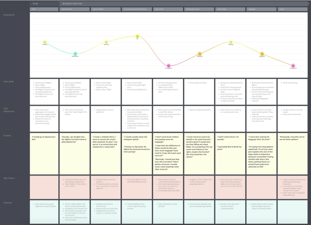
Customer Journey Mapping
I created a full journey map capturing user goals, motivations, behaviours, pain points, and moments of delight across the booking process.
This exposed the highest-impact UX issues: confusing search inputs, unclear results, unpredictable add-ons, and a long, fragmented checkout.
-
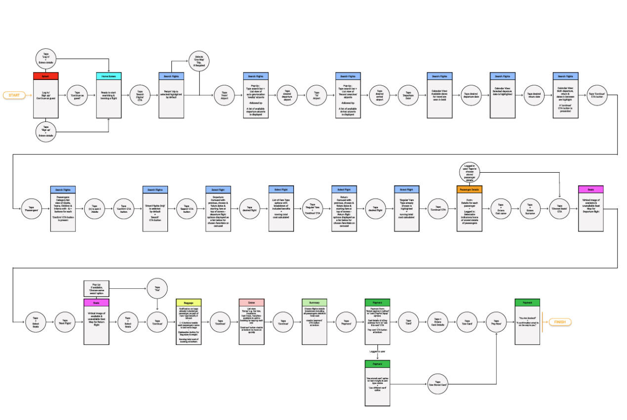
User Flow
With the insights defined, I mapped a clear, linear end-to-end flow - from home screen to booking confirmation.
The goal was to reduce cognitive load, simplify decision points, and ensure transparency at each step.
Interaction Design
I sketched every screen to define functional behaviour, screen states, hierarchy, and mobile interactions.
These sketches formed the blueprint for the prototype and later wireframes.


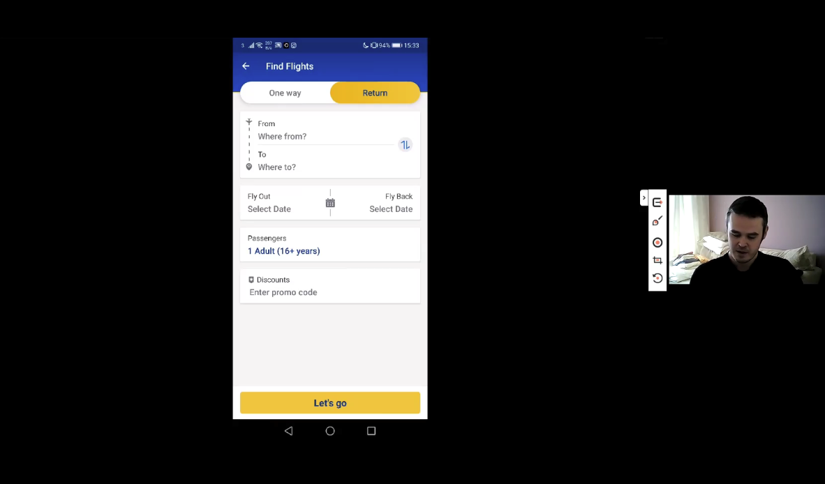
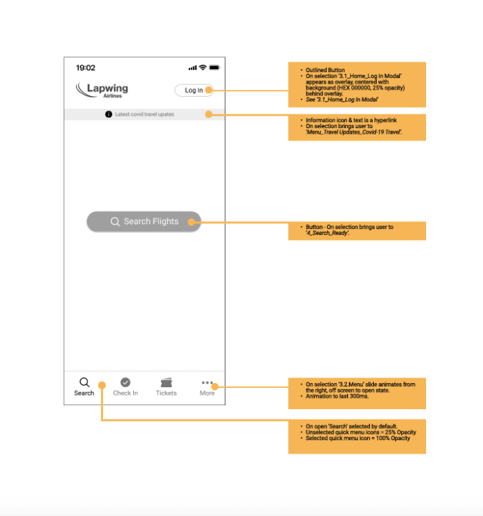
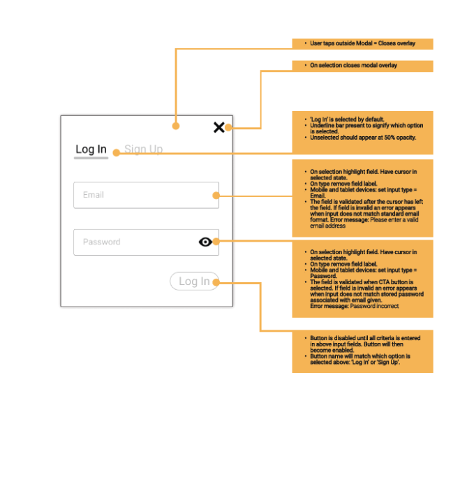
Interactive Prototype
The high-fidelity mobile prototype was built to test navigation, clarity, and completeness of the redesigned booking flow. It brings the full journey to life — from flight search to payment and confirmation.
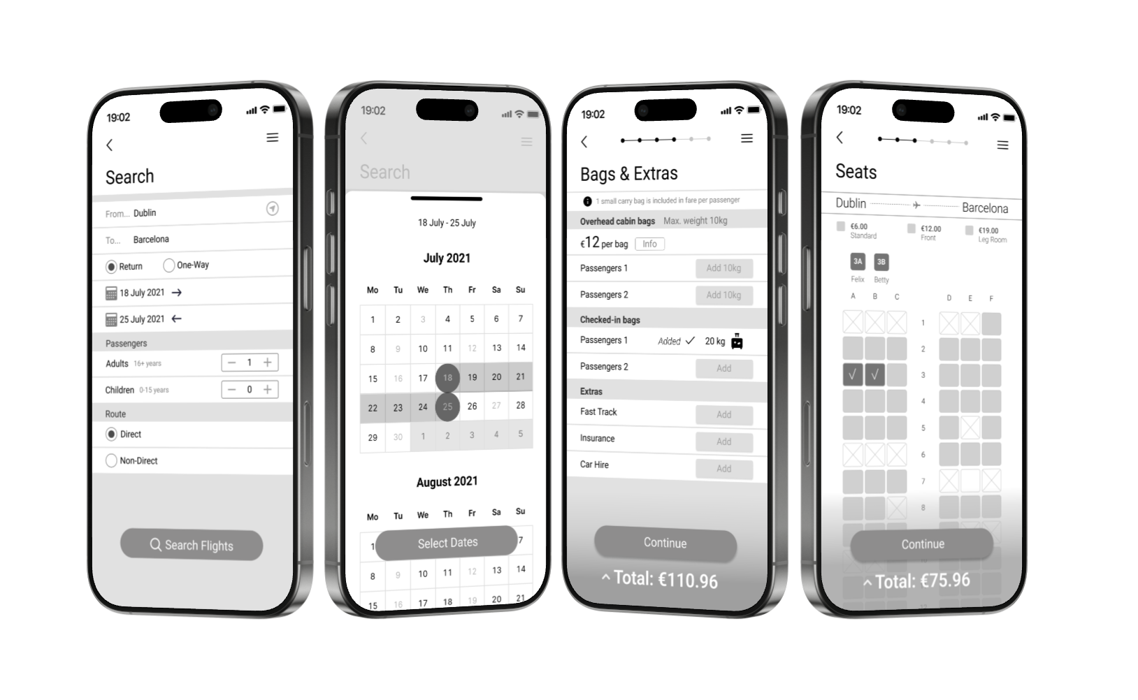
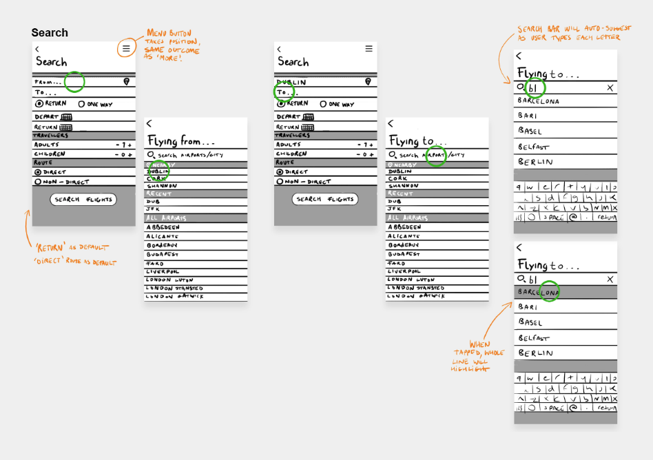
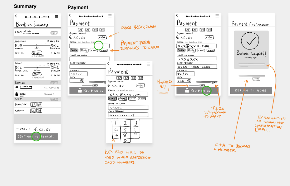
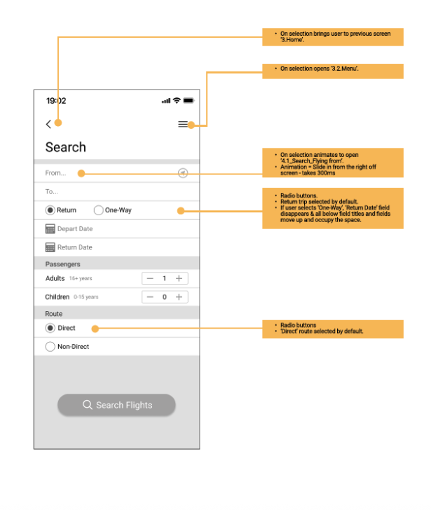
Wireframes
The final stage involved creating developer-ready wireframes detailing screen states, behaviours, and interaction rules.
This ensured no ambiguity for build and captured every edge case uncovered through testing.
What I Learned
This project strengthened my ability to:
Synthesise large volumes of research into clear problem statements
Let insights shape product decisions
Design mobile-first flows with attention to usability and clarity
Move quickly from concept → sketches → prototype → wireframes
Present work in a structured, professional UX case-study format
It also reinforced the importance of trusting the UX process and letting patterns reveal themselves naturally through structured research and iteration.